Information Architecture (IA) plays a vital role in creating intuitive and well structured navigation, content flow and structure of a software, website, intranet or mobile application.
IA has two main components:
o Identification and definition of app content/functionality.
o The underlying organization, structure and nomenclature that define the relationships between a app’s content/functionality.
The IA is not part of the on-screen user interface (UI) — rather, IA informs UI. The IA is documented in spreadsheets and diagrams, usually not in wireframes, comprehensive layouts (known as comps), or prototypes.
Information Architects (IAs) are not just designers, analysts or project managers. IAs work with designers, analysts, different departments, usability testers and stakeholders and try to accumulate an in-depth understanding of the requirement which will result in developing the software/ website/ application. In this context, it will be important to note that IAs should either conduct or should have access to the usability test (results), card sorting exercises, stakeholder and user interviews, surveys etc., in order to gather as much information about different influencing factors of the project as possible. They also should be able do create mental models of user’s and understand how the information or functionalities provided by the proposed application/software will be used and consumed by them.
Typically the activities undertaken in defining information architecture involve:
o Content inventory: Examination of an existing application/website to locate and identify existing app/site content
o Content audit: Evaluation of content hierarchy, relevance, priorities, usefulness, accuracy and overall effectiveness
o Information grouping: Definition of user-centered relationships between content and its types.
o Taxonomy development: Definition of a standardized naming convention (controlled vocabulary) to apply to all site content.
o Descriptive information creation: Definition of useful metadata that can be utilized to generate “Related Link” lists or other navigation components that aid discovery.
As we live in Smartphone era and Mobile apps and Mobile websites are overtaking conventional software and websites, understanding how the information and navigation flows in Mobile application scenarios are becoming more and more crucial.
As designers, developers, and UX experts put their efforts in to creating successful and better Mobile applications or Mobile websites, they face the following challenges:
o What will be the right interface (responsive design, adaptive design, native app, etc.)?
o How do I design the better navigation?
o How do I maximize the use of screen real estate?
o What type of patterns and screen elements shall I use?
o How do I build prototype and conduct the usability test?
o What type of UI design and user experience approach shall I adopt?
The first two questions concern the structuring and labeling of content, which is basically the foundation of Information Architecture. Then it gets translated into the site map and process map diagrams.
The Information Architect accumulates knowledge from the discovery period to define what the primary objectives are and how it will achieve those. Information Architect also works with other team members like designers, business analysts and developers to gain other insights and develop personas.
Next step for an Information Architect is to create the architecture of the site or app. It is done by means of creating site/ app maps, flow diagrams, wireframes etc., to provide an in-depth understanding how the app/site will work from usability perspective. IAs are required to take different perspectives and contexts into account such as: users, locations, time, situation, business, technological constraints, screen constraints, legal implications etc.
Most modern, mobile devices come with touch screens; which provide their own set of opportunities and constraints. We use them not only to view content, but also to interact with that content. This forces designers to consider ergonomics, gestures, transitions, and finally, mobile-specific interaction patterns.
The mobile app/site should only contain what's important and contextual to the user when using mobile phone. This doesn't necessarily mean user is outside. Some apps/sites are used more on the go (maps, phone directories) and some are used more inside in the house (TV show/movie info). Understand how users will use the app or site.
Users prefer shorter and more prominent content on mobile. Which means keep the key content on main sections and leave the secondary content for the lower level screens.
Menus can't have too many options. Tabbed menus usually contain 5 tabs at most. Try to group different menu items into one and keep the most important ones at the top.
Part of my daily engagement is preparing information architecture for our client’s mobile applications, mobile sites and website; and managing a team of Information Architects.
Information Architecture is more crucial and challenging for mobile sites/apps because of various screen resolutions, which can be as low as 120pixels and as high as 2560pixels, different form factors, platforms and connectivity and career restrictions.
Because of limited screen real estate and volatile signal strengths, you can only display a limited amount of content with limited amount of links. Especially if user is in a location where connection strength is low, loading a simple image can take long time thus causing frustration to the user.
So you need to strike a balance between content intensity and relevance in order to provide the most optimum experience to the user.
In order to create an engaging and immersive mobile experience, we need to radically rethink the conventional desktop centric design. Mobile information architecture is all about simplification and elimination; grouping content and placing them by context; taking into account the uncertain connection speed and large variety of device and OS features. And of course rapid changes in the industry. Its’ all about grouping and arranging content and tasks into a logical flow and help users to easily find information and complete certain tasks. These tasks could be navigation, reading content, paying bills, signing up, search etc.
Also mobile use is contextual. We use them while walking, riding bus or car, while waiting, at the airport, hospital; virtually everywhere. So it is very important for the information architecture to be relevant depending on the location, time and type of stuff user is trying to do based on where and when.
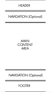
If we start with navigation, then it should be easy to learn and use, consistent, should provide feedback, minimize clicks and maximize results, easy to tap, properly labeled, should have nice and pleasing transitions, grouped logically by importance etc.
Navigation should also help user to find key content and perform key tasks easily and fast. Incorporating navigational cues also help users by giving them a sense of location within the mobile experience. For example, back button can always bring user back to Home Screen or navigational hubs. Also make sure that tappable regions are not too small. User should be able to use their fingertips to precisely tap and select the specific navigational items.
Information Architecture should be able to impress and engage users with your application. If it is complicated and confusing, users won’t adapt it.
Once Information Architecture is properly in place, rest of the things such as Visual Design, System Architecture, Development and Usability Testing can begin.
When it comes to the tools, I prefer to use MS Visio and Axure. However IA is more like an analytical and mental job than something that you can do using just tools. However, tools can help to create site maps, process maps and wireframes. I also use sticky notes and pen and paper to draw and note down items for further processing.
When it comes to Mobile Delivery methods, we can think of three key methods: Mobile Website, Native App and Hybrid App. Native apps are self-contained: every screen of the application is defined up front. Hybrid apps offer a bit more flexibility, loading content from the web (as it’s viewed in a browser) but providing users with an “app-like” interface (or chrome).
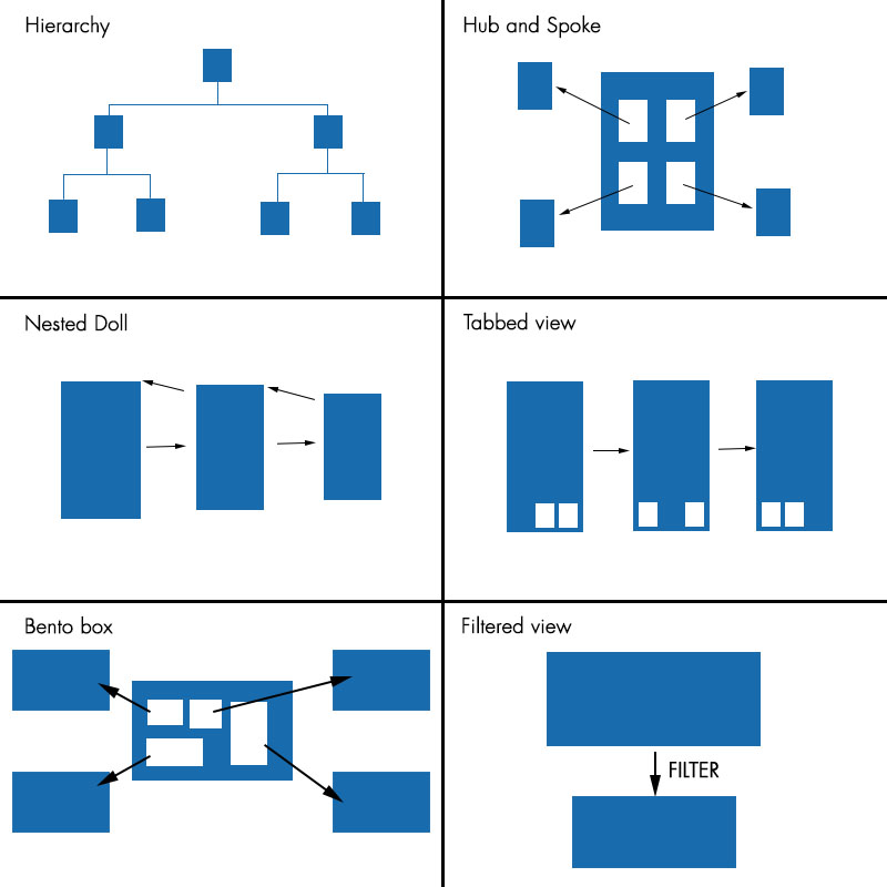
Over the past few years, Mobile Information Architecture patterns have been evolved and based on many trial and error, industry have adopted few popular patterns; which are: Tabbed, Hierarchy, Hub & Spoke, Nested doll, Bento box, Filtered view etc.
General rule of thumb of using these variations is as follows:
o Hierarchy is good for Organising complicated site structures that need to be close to standard website’s structure.
o Hub and Spoke is good for Multi-functional tools, each with a different segment, navigation and purpose.
o Nested Doll is good for Apps or sites with singular or closely related topics. This can also be used as a sub section pattern inside other parent patterns, such as the standard hierarchy pattern or hub and spoke.
o Tabbed view is good for Tools based apps with a similar theme.
o Bento box is good for Multi-functional tools and content-based tablet apps that have a similar theme.
o Filtered view is good for Apps or sites with large quantities of content, such as articles, images and videos. Can be a good basis for magazine style apps or sites, or as a sub pattern within another navigational pattern.
Below are the graphical representation of the above mentioned patterns.
Information Architecture is more crucial and challenging for mobile sites/apps because of various screen resolutions, which can be as low as 120pixels and as high as 2560pixels, different form factors, platforms and connectivity and career restrictions.
Because of limited screen real estate and volatile signal strengths, you can only display a limited amount of content with limited amount of links. Especially if user is in a location where connection strength is low, loading a simple image can take long time thus causing frustration to the user.
So you need to strike a balance between content intensity and relevance in order to provide the most optimum experience to the user.
In order to create an engaging and immersive mobile experience, we need to radically rethink the conventional desktop centric design. Mobile information architecture is all about simplification and elimination; grouping content and placing them by context; taking into account the uncertain connection speed and large variety of device and OS features. And of course rapid changes in the industry. Its’ all about grouping and arranging content and tasks into a logical flow and help users to easily find information and complete certain tasks. These tasks could be navigation, reading content, paying bills, signing up, search etc.
Also mobile use is contextual. We use them while walking, riding bus or car, while waiting, at the airport, hospital; virtually everywhere. So it is very important for the information architecture to be relevant depending on the location, time and type of stuff user is trying to do based on where and when.
If we start with navigation, then it should be easy to learn and use, consistent, should provide feedback, minimize clicks and maximize results, easy to tap, properly labeled, should have nice and pleasing transitions, grouped logically by importance etc.
Navigation should also help user to find key content and perform key tasks easily and fast. Incorporating navigational cues also help users by giving them a sense of location within the mobile experience. For example, back button can always bring user back to Home Screen or navigational hubs. Also make sure that tappable regions are not too small. User should be able to use their fingertips to precisely tap and select the specific navigational items.
Information Architecture should be able to impress and engage users with your application. If it is complicated and confusing, users won’t adapt it.
Once Information Architecture is properly in place, rest of the things such as Visual Design, System Architecture, Development and Usability Testing can begin.
When it comes to the tools, I prefer to use MS Visio and Axure. However IA is more like an analytical and mental job than something that you can do using just tools. However, tools can help to create site maps, process maps and wireframes. I also use sticky notes and pen and paper to draw and note down items for further processing.
When it comes to Mobile Delivery methods, we can think of three key methods: Mobile Website, Native App and Hybrid App. Native apps are self-contained: every screen of the application is defined up front. Hybrid apps offer a bit more flexibility, loading content from the web (as it’s viewed in a browser) but providing users with an “app-like” interface (or chrome).
Over the past few years, Mobile Information Architecture patterns have been evolved and based on many trial and error, industry have adopted few popular patterns; which are: Tabbed, Hierarchy, Hub & Spoke, Nested doll, Bento box, Filtered view etc.
General rule of thumb of using these variations is as follows:
o Hierarchy is good for Organising complicated site structures that need to be close to standard website’s structure.
o Hub and Spoke is good for Multi-functional tools, each with a different segment, navigation and purpose.
o Nested Doll is good for Apps or sites with singular or closely related topics. This can also be used as a sub section pattern inside other parent patterns, such as the standard hierarchy pattern or hub and spoke.
o Tabbed view is good for Tools based apps with a similar theme.
o Bento box is good for Multi-functional tools and content-based tablet apps that have a similar theme.
o Filtered view is good for Apps or sites with large quantities of content, such as articles, images and videos. Can be a good basis for magazine style apps or sites, or as a sub pattern within another navigational pattern.
Below are the graphical representation of the above mentioned patterns.
There are other factors which Information Architects should keep in mind (however those are more relevant while doing the visual design and defining the transitions and interactions) such as device dimensions, device density or resolution, platform limitations, native standards, dimension of each tappable area, gestures, transition patterns etc.

 RSS Feed
